
5 Power BI Projects to Add to Your Resume in 2026
A detailed project-building guide for working professionals who want to prove practical Power BI skills, build a stronger portfolio, and speak confidently about their work in interviews.
If you are learning Power BI because you want a better role, a stronger appraisal, a transition into analytics, or simply more confidence working with business data, projects are one of the most important parts of your learning journey.
However, there is a major difference between a dashboard you build while following a tutorial and a project that genuinely deserves a place on your resume.
A tutorial usually tells you what to click. A portfolio project should show that you can think independently. You should be able to explain the business problem, inspect the raw data, clean it using Power Query, decide how the tables should relate to each other, write the required DAX measures, choose appropriate visuals, validate the numbers, identify insights and recommend actions.
This guide will walk you through five practical Power BI projects that can help you demonstrate those capabilities:
- Sales Performance Dashboard
- Financial Analysis Dashboard
- HR Analytics Dashboard
- Supply Chain and Inventory Dashboard
- Customer Analysis Dashboard
For each project, we will go beyond simply naming a dashboard. You will see the business scenario, suggested dataset structure, cleaning tasks, data model, KPIs, DAX ideas, dashboard layout, analysis questions, advanced extensions, interview questions and resume-writing examples.
The goal is not to give you five dashboards to copy. The goal is to show you how to think while building them.
What recruiters actually look for in a Power BI project
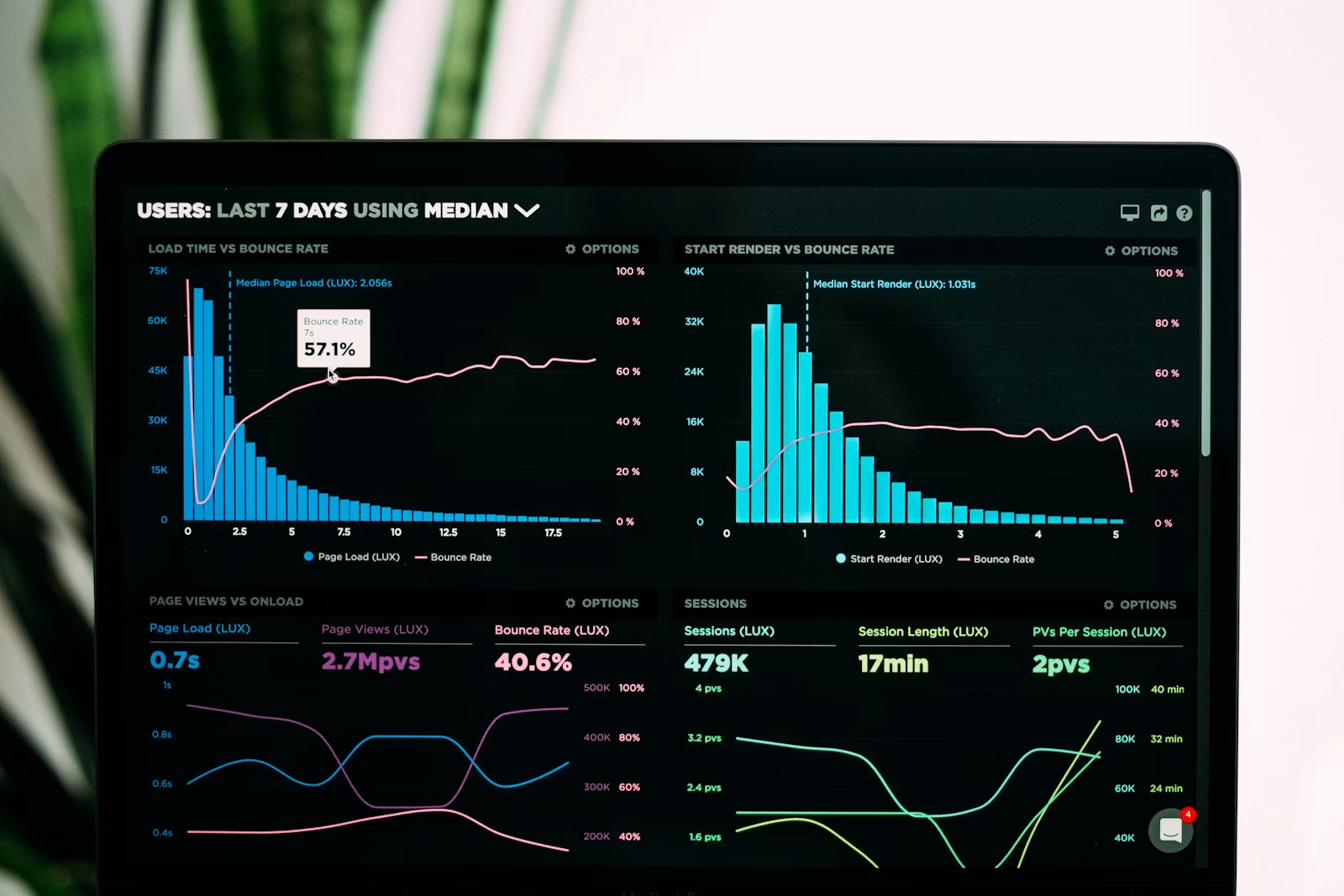
When a recruiter or hiring manager looks at a Power BI project, the visual appearance is only one part of the evaluation. A polished dashboard can create a good first impression, but that impression becomes weak very quickly if the person who built it cannot explain how the numbers were calculated or why the model was designed in a particular way.
A stronger project demonstrates capability across several layers.
1. Business understanding
You should be able to explain why the dashboard exists. What decision is the business trying to make? What problem is being solved? Which KPIs matter and why?
For example, a sales dashboard should not exist simply because “the company wants a dashboard.” A stronger problem statement would be: “Sales growth has slowed over the last two quarters and management wants to understand whether the slowdown is being driven by region, product category, customer behaviour or declining salesperson productivity.”
2. Data preparation
Real-world data is rarely perfect. You may receive monthly Excel files, inconsistent product names, duplicate transactions, blank values, incorrect data types, missing customer IDs or dates stored as text.
When you can explain how you identified and corrected these issues in Power Query, your project becomes more realistic.
3. Data modelling
One of the clearest signs that a learner has moved beyond basic dashboard creation is the ability to build a sensible data model. Instead of putting everything into one massive table, you should understand when to separate transactions from descriptive dimensions such as Date, Product, Customer, Region or Department.
4. DAX and business logic
DAX is not about memorising hundreds of functions. It is about translating a business question into a calculation. If management asks for year-over-year growth, target achievement, repeat customer rate or attrition rate, your measures should reflect that business logic correctly.
5. Visual communication
The goal of a dashboard is not to show how many visuals you know. It is to help someone understand what is happening and where they should look next.
6. Validation
A dashboard is useful only if the numbers are reliable. A strong project includes a validation process. You should be able to explain how you cross-checked totals, tested filters and confirmed that calculations behave correctly.
7. Communication
Finally, you should be able to tell the story of the project clearly. In an interview, you may have only two or three minutes to explain what you built. A clear explanation can be more valuable than an overloaded dashboard.
Data Drishti’s Power BI learning approach is built around practical implementation, real-world projects, dashboard creation and portfolio development, which is particularly useful for working professionals who want to move beyond passive tutorial learning.
The framework every Power BI portfolio project should follow
Before choosing a dataset or opening Power BI Desktop, define a repeatable framework. This keeps the project organised and makes it easier to explain later.
Business problem → data source → Power Query → data model → DAX → dashboard → validation → insights → recommendations → portfolio documentation → interview explanation
Step 1: Write the business problem
Write two or three sentences describing why the dashboard is needed. Mention the business user, the decision and the problem.
Weak: “Create a sales dashboard.”
Better: “The sales director needs to understand why quarterly revenue growth has slowed and wants to compare regions, products, salespeople and customer segments against the previous year and internal targets.”
Step 2: Identify the tables
Think about what data is required to answer the questions. For a sales dashboard, one transaction table may not be enough. You may also need Product, Customer, Region, Salesperson, Target and Date tables.
Step 3: Inspect and clean the raw data
Before modelling, check data types, blanks, duplicates, inconsistent text, missing IDs, date issues and unexpected values.
Step 4: Build the model
Decide which table represents business events and which tables provide descriptive context. Create relationships carefully and avoid unnecessary many-to-many relationships unless you understand why they are required.
Step 5: Create measures
Start with simple measures such as Total Sales or Total Employees. Then create more analytical measures such as growth rates, ratios, ranks, averages and time-intelligence calculations.
Step 6: Design the dashboard
Organise information in layers. Start with top-level KPIs, move to trends, then diagnostic breakdowns such as region, product or department.
Step 7: Validate the result
Compare important dashboard numbers against raw data, pivot tables or manual calculations. Test multiple filters and dates.
Step 8: Write insights
Do not repeat the visual. Instead of writing “West region has 25% of sales,” explain why that matters. For example: “West region contributes 25% of sales but 38% of profit, suggesting a stronger product mix or lower discounting.”
Step 9: Recommend an action
A recommendation does not need to be perfect. It should simply connect the analysis to a business decision.
Step 10: Prepare your explanation
Practise explaining the project using the same sequence: problem, data, cleaning, model, measures, dashboard, insights and recommendations.
Why data modelling deserves its own section
Many beginners jump directly from importing a file to adding visuals. This works for small datasets, but it can create problems as the project becomes more complex.
Data modelling is the layer that connects your raw data to your calculations.
Suppose your sales data contains one row per order line. That table may have Product ID, Customer ID, Region ID, Order Date, Quantity and Revenue. Instead of repeating product descriptions, customer attributes and region information on every transaction row, you can separate those descriptive fields into dimension tables.
The resulting structure may look like this:
- FactSales: Order ID, Order Date, Product ID, Customer ID, Region ID, Quantity, Revenue, Cost
- DimDate: Date, Month, Quarter, Year, Financial Year
- DimProduct: Product ID, Product Name, Category, Brand
- DimCustomer: Customer ID, Customer Name, Segment, City
- DimRegion: Region ID, Region Name
This structure is commonly referred to as a star schema because the fact table sits at the centre and the dimensions connect around it.
A good model can make DAX easier to write, reduce ambiguity, improve performance and make the report easier to maintain.

When documenting your project, include a screenshot of your model view. It gives the recruiter immediate evidence that you have thought about relationships and not only dashboard design.
Project 1: Sales Performance Dashboard
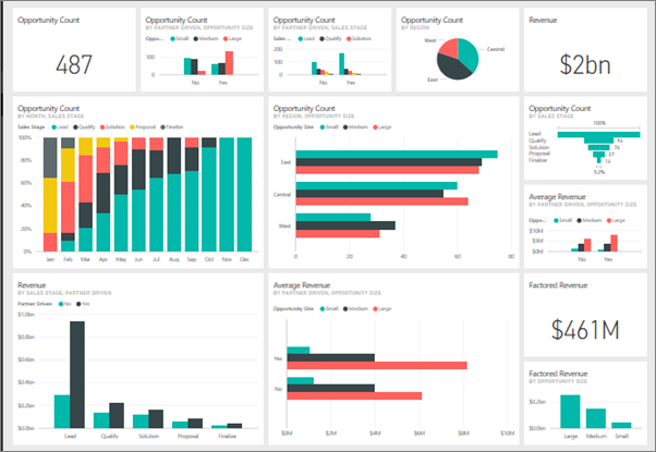
A Sales Performance Dashboard is one of the strongest projects for beginners because almost every business understands sales, customers, products, targets and growth. At the same time, the project can become advanced enough to demonstrate Power Query, modelling, DAX, time intelligence, ranking and business analysis.
Business scenario
Imagine a company that sells products across multiple regions. Revenue has grown over the year, but management is worried that profit margins are falling and certain salespeople are missing targets. The sales director wants a dashboard that answers three broad questions:
- How is the business performing overall?
- What is driving the performance?
- Where should management take action?
Suggested dataset structure
You can create or download data containing the following tables.
Sales table
- Order ID
- Order Date
- Product ID
- Customer ID
- Salesperson ID
- Region ID
- Quantity
- Unit Price
- Discount Amount
- Cost
- Revenue
Product table
- Product ID
- Product Name
- Category
- Subcategory
- Brand
Customer table
- Customer ID
- Customer Name
- Segment
- City
- State
- Acquisition Date
Salesperson table
- Salesperson ID
- Name
- Team
- Manager
Target table
- Month
- Salesperson ID
- Revenue Target
Power Query work you should demonstrate
Do not start with a perfectly clean dataset. Give yourself realistic data-cleaning work.
- Append twelve monthly sales files into one fact table.
- Remove duplicate order lines.
- Convert date fields from text into date data types.
- Standardise region names such as “South”, “south” and “SOUTH”.
- Replace blank product IDs only after investigating whether they represent data errors.
- Create Revenue if the source contains Quantity, Unit Price and Discount instead of a final revenue field.
- Merge a product lookup table to confirm that every Product ID has a matching product.
- Trim extra spaces from customer or salesperson names.
How to model the data
Place the Sales table at the centre as the fact table. Connect Date, Product, Customer, Region and Salesperson as dimensions using one-to-many relationships.
The Target table can connect to Date and Salesperson. Depending on how your target data is structured, you may need to model monthly targets carefully so that the relationship works correctly at the desired granularity.
Core measures to create
Total Sales
Total Sales = SUM(Sales[Revenue])
This is your base measure. It looks simple, but many other measures will build on top of it.
Total Profit
Total Profit = SUM(Sales[Revenue]) - SUM(Sales[Cost])
Profit Margin %
Profit Margin % = DIVIDE([Total Profit], [Total Sales])
Using DIVIDE instead of the / operator is useful because it handles division-by-zero scenarios more safely.
Sales Last Year
Sales LY = CALCULATE([Total Sales], SAMEPERIODLASTYEAR('Date'[Date]))
YoY Growth %
YoY Growth % = DIVIDE([Total Sales] - [Sales LY], [Sales LY])
Average Order Value
Average Order Value = DIVIDE([Total Sales], DISTINCTCOUNT(Sales[Order ID]))
Target Achievement %
Target Achievement % = DIVIDE([Total Sales], [Sales Target])
Dashboard layout
A useful layout can have four horizontal layers.
Layer 1: KPI cards
Total Sales, Total Profit, Profit Margin, Orders and YoY Growth.
Layer 2: Trend
Monthly sales and profit trend compared with the previous year.
Layer 3: Drivers
Region performance, product-category performance and salesperson target achievement.
Layer 4: Diagnostic detail
Customer-level or product-level table with conditional formatting, allowing the user to investigate outliers.
Business questions your dashboard should answer
- Is revenue growing?
- Is profit growing at the same rate?
- Which regions are gaining or losing momentum?
- Which categories generate revenue but weak margins?
- Which salespeople consistently exceed targets?
- Which customers account for the largest share of revenue?
- Is the company becoming overly dependent on a small group of customers?
Example insight
A weak observation would be: “Product Category A generated ₹12 million.”
A stronger insight would be: “Product Category A contributed 32% of revenue but only 18% of profit because the average discount rate increased significantly in the last quarter.”
Example recommendation
“Review discounting rules for Category A and analyse whether lower-margin orders are concentrated among specific customers or salespeople.”
Advanced extensions
- Add dynamic Top N filtering.
- Add customer segmentation.
- Create rolling 3-month sales measures.
- Add sales forecast visuals.
- Add drill-through pages for salesperson and customer analysis.
- Create field parameters that let the user switch between Revenue, Profit and Quantity.
How to describe the project on your resume
Example resume bullet: Built an interactive Power BI sales dashboard using Power Query, star-schema modelling and DAX to analyse revenue growth, profit margin, product contribution, customer concentration and salesperson target achievement.
Interview questions you should prepare for
- Why did you create a Date table?
- Why did you use a measure instead of a calculated column?
- How does SAMEPERIODLASTYEAR work?
- How did you validate Total Sales?
- Why did you create separate Product and Customer dimensions?
- What would happen if a Sales row had a Product ID that did not exist in Product?
- How would you improve this model if the data grew to hundreds of millions of rows?
Project 2: Financial Analysis Dashboard

A Financial Analysis Dashboard is especially useful for professionals from finance, accounting, FP&A, business operations or management reporting. It demonstrates your ability to work with actuals, budgets, variance, margins and time-based calculations.
Business scenario
Leadership wants a single view of financial performance across departments. Revenue is close to plan, but operating expenses have increased unexpectedly. The finance team needs to identify which departments and cost categories are responsible for the variance.
Suggested dataset structure
Actuals table
- Date
- Department ID
- Account ID
- Cost Centre
- Amount
Budget table
- Month
- Department ID
- Account ID
- Budget Amount
Account table
- Account ID
- Account Name
- Account Category
- P&L Group
Department table
- Department ID
- Department Name
- Business Unit
- Manager
Power Query work
- Append monthly finance files.
- Map GL codes into reporting categories.
- Unpivot budget files where months are stored as columns.
- Correct inconsistent department names.
- Check whether positive and negative values are being used consistently.
- Remove subtotal rows before loading data into Power BI.
Data model
You can use Actuals and Budget as two fact tables sharing common dimensions such as Date, Department and Account.
This introduces an important modelling concept: not every project needs only one fact table. When two business processes have different data sources but share dimensions, a multiple-fact model may be appropriate.
Core measures
Actual Amount
Actual Amount = SUM(Actuals[Amount])
Budget Amount
Budget Amount = SUM(Budget[Budget Amount])
Variance
Variance = [Actual Amount] - [Budget Amount]
Variance %
Variance % = DIVIDE([Variance], [Budget Amount])
YTD Actual
YTD Actual = TOTALYTD([Actual Amount], 'Date'[Date])
YTD Budget
YTD Budget = TOTALYTD([Budget Amount], 'Date'[Date])
Dashboard layout
Start with top-level financial KPIs such as Revenue, Expense, Profit and Net Margin. Add a monthly Actual vs Budget trend, department-level variance chart, cost-category breakdown and a detailed P&L matrix.
A waterfall chart can be useful for showing how different cost categories contributed to a change in profit.
Business questions to answer
- Are we above or below budget?
- Which departments contribute most to the variance?
- Are expenses growing faster than revenue?
- Which cost categories changed the most?
- Is profitability improving or declining?
- Are favourable variances recurring or one-time?
Example insight
“Operating expense is 8% above budget, driven primarily by logistics and contractor costs in the South business unit. Revenue is 3% above budget, so the business is growing but profitability is being compressed.”
Advanced extensions
- Scenario analysis using What-If parameters.
- Forecasted year-end profit.
- Department drill-through pages.
- Dynamic P&L statements.
- Variance decomposition.
Resume description
Example: Developed a Power BI financial analysis dashboard to compare actuals against budget, track profitability and analyse department-level variance using Power Query, multi-fact modelling and DAX time intelligence.
Interview questions
- Why did you use separate Actual and Budget fact tables?
- How did you ensure both tables could be analysed by the same Date dimension?
- How did you treat expenses with negative accounting signs?
- What is the difference between YTD and a running total?
- How would you model a financial year that starts in April?
Midway check: what should your first two projects prove?
By the time you have completed the Sales and Financial projects, your portfolio should already demonstrate several core capabilities:
- Importing and transforming data in Power Query
- Creating a star schema
- Working with more than one fact table
- Writing base measures and ratio measures
- Using time-intelligence calculations
- Building business-focused dashboards
- Explaining insights beyond what is visually obvious
If you can build these projects without copying step-by-step instructions and can explain every design choice, you are moving from “Power BI learner” toward “Power BI practitioner.”
If you need structured guidance while building projects, Data Drishti offers one-to-one Power BI mentorship for working professionals with a focus on practical implementation, project feedback and portfolio development.
Project 3: HR Analytics Dashboard

An HR Analytics Dashboard is useful because it introduces a different kind of analysis. Instead of analysing orders or money, you are analysing people, tenure, hiring, exits and workforce composition.
Business scenario
The HR leadership team is concerned about rising employee attrition. Management wants to understand whether attrition is concentrated in particular departments, locations, job roles or tenure bands.
Suggested dataset
Employee table
- Employee ID
- Joining Date
- Exit Date
- Department ID
- Job Role ID
- Location ID
- Manager ID
- Salary Band
- Employment Type
Department table
- Department ID
- Department Name
- Business Unit
Job Role table
- Job Role ID
- Role Name
- Level
Power Query work
- Standardise department names.
- Convert blank Exit Dates correctly rather than replacing them blindly.
- Create data-quality checks for employees with Exit Date earlier than Joining Date.
- Standardise job role names.
- Create tenure bands.
- Handle duplicate Employee IDs.
Important modelling decision
HR datasets often contain multiple dates, such as Joining Date and Exit Date. You may need to decide whether to use one active date relationship and another inactive relationship, then activate the second relationship inside measures using USERELATIONSHIP.
This is an excellent modelling concept to explain in an interview.
Core KPIs
- Total Headcount
- Active Employees
- New Hires
- Exits
- Attrition Rate
- Average Tenure
- Headcount Growth
- Average Salary
Example measures
Active Employees
Active Employees =
CALCULATE(
    DISTINCTCOUNT(Employee[Employee ID]),
    ISBLANK(Employee[Exit Date])
)
Exits
Exits =
CALCULATE(
    DISTINCTCOUNT(Employee[Employee ID]),
    USERELATIONSHIP('Date'[Date], Employee[Exit Date])
)
The exact logic may vary depending on the structure of your data, but this is a good opportunity to understand active and inactive relationships.
Dashboard layout
Start with headcount, new hires, exits and attrition rate. Add monthly hiring and exits, attrition by department, tenure distribution, location analysis and role-level breakdown.
Analysis questions
- Is attrition increasing?
- Which departments have the highest attrition?
- Does attrition occur mostly within the first year?
- Are particular job roles more affected?
- Is one location experiencing unusually high turnover?
- Is hiring keeping pace with exits?
Example insight
“Employees with less than one year of tenure account for 42% of exits, and the highest concentration occurs in the Customer Support department.”
Possible recommendation
“Review onboarding, manager support and early-stage role expectations within Customer Support, then compare retention after the intervention.”
Advanced extensions
- Retention cohort analysis.
- Manager-level attrition view.
- Promotion analysis.
- Compensation-band analysis.
- Diversity metrics where legally and ethically appropriate.
Resume description
Example: Created an HR analytics dashboard in Power BI to analyse headcount, hiring, attrition and tenure trends across departments and locations using Power Query and DAX.
Interview questions
- How did you calculate attrition?
- How did you handle Joining Date and Exit Date?
- What is USERELATIONSHIP?
- How would you calculate active headcount as of a historical date?
- How did you validate the employee count?
Project 4: Supply Chain and Inventory Dashboard

A Supply Chain and Inventory Dashboard is a strong intermediate portfolio project because it introduces operational metrics such as stockouts, lead time, fulfilment rate, inventory value and supplier performance.
Business scenario
An operations team is facing two problems at the same time: some warehouses are frequently running out of high-demand products while other products remain overstocked. Management wants to understand inventory health, supplier reliability and order fulfilment.
Suggested dataset structure
Inventory table
- Date
- Warehouse ID
- Product ID
- Closing Stock Quantity
- Inventory Value
Purchase Orders table
- PO ID
- Supplier ID
- Product ID
- Order Date
- Expected Delivery Date
- Actual Delivery Date
- Quantity Ordered
- Quantity Received
Supplier table
- Supplier ID
- Supplier Name
- Supplier Region
- Supplier Category
Product table
- Product ID
- Product Name
- Category
- Reorder Point
- Unit Cost
Power Query work
- Append inventory snapshots from multiple warehouses.
- Standardise supplier names.
- Calculate delivery delay in days.
- Handle missing Actual Delivery Dates.
- Check whether received quantities exceed ordered quantities.
- Standardise product categories.
Core KPIs
- Inventory Value
- Stockout Count
- Overstock Count
- Average Lead Time
- On-Time Delivery %
- Fill Rate
- Days of Inventory
- Supplier Delay Rate
Example calculations
On-Time Delivery % should compare the number of orders delivered on or before the expected date against total delivered orders.
Fill Rate can compare Quantity Received against Quantity Ordered.
Stockout Count can count products whose stock is zero or below a defined reorder threshold.
Dashboard layout
Start with Inventory Value, Stockouts, Fill Rate and On-Time Delivery. Add warehouse-level stock analysis, supplier lead-time ranking, inventory trend, product-level exceptions and purchase-order detail.
Analysis questions
- Which warehouses experience the most stockouts?
- Which products remain overstocked?
- Which suppliers consistently deliver late?
- Do stockouts correlate with longer supplier lead times?
- Which products have high inventory value but low movement?
- Which warehouses have poor fulfilment rates?
Example insight
“Supplier B has the longest average lead time and is associated with three of the five products that experienced repeated stockouts.”
Recommendation
“Increase reorder buffers for high-demand products sourced from Supplier B while evaluating alternate suppliers for critical SKUs.”
Advanced extensions
- ABC inventory classification.
- Demand forecast.
- Reorder-point indicators.
- Warehouse drill-through pages.
- Supplier scorecards.
- Safety-stock scenario analysis.
Resume description
Example: Built a Power BI supply chain dashboard to monitor inventory value, stockouts, supplier lead time, fulfilment rate and on-time delivery across multiple warehouses.
Interview questions
- How did you calculate on-time delivery?
- How did you model inventory snapshots?
- What is the difference between a transaction table and a snapshot table?
- How would you calculate stock as of a specific date?
- How would you handle missing delivery dates?
Project 5: Customer Analysis Dashboard

A Customer Analysis Dashboard is useful for professionals in sales, marketing, e-commerce, CRM and business analytics because it focuses on acquisition, repeat behaviour, customer value and segmentation.
Business scenario
A company is acquiring more customers every month, but management is unsure whether those customers are returning. The business wants to understand the relationship between acquisition, repeat purchases and customer value.
Suggested dataset structure
You can reuse a Sales fact table but expand the Customer dimension.
Customer table
- Customer ID
- Customer Name
- Signup Date
- Acquisition Channel
- City
- State
- Customer Segment
Sales table
- Order ID
- Order Date
- Customer ID
- Product ID
- Order Value
Power Query tasks
- Remove duplicate customer records.
- Standardise customer IDs.
- Correct missing geography where possible.
- Merge acquisition channel data.
- Check first-order dates against signup dates.
Core KPIs
- Unique Customers
- New Customers
- Repeat Customers
- Repeat Purchase Rate
- Revenue per Customer
- Average Order Value
- Customer Contribution %
- Customer Lifetime Value proxy
New vs repeat customers
This is where the project becomes more interesting. You need to decide what “new” means. Is a customer new in the selected month if their first purchase occurred in that month? Is a repeat customer anyone whose first purchase happened earlier?
Document your definition before writing the DAX.
Customer ranking
Use RANKX to identify high-value customers. Then analyse whether the business is dependent on a small number of buyers.
RFM-style segmentation
RFM stands for Recency, Frequency and Monetary value.
- Recency: How recently did the customer purchase?
- Frequency: How often did the customer purchase?
- Monetary: How much revenue did the customer generate?
You can score customers and group them into segments such as Champions, Loyal, At Risk or Low Value.
Dashboard layout
Start with total customers, new customers, repeat rate and revenue per customer. Add new-vs-repeat trend, acquisition-channel performance, geographic analysis, customer segmentation and a Top Customers table.
Analysis questions
- Are we acquiring more customers?
- Are those customers returning?
- Which channels bring high-value customers?
- Which regions have strong acquisition but weak retention?
- How concentrated is revenue among top customers?
- Which customer segments are at risk?
Example insight
“Paid social generated the highest number of new customers, but referral customers had a significantly higher repeat rate and average revenue per customer.”
Recommendation
“Evaluate acquisition efficiency using both first-order conversion and repeat behaviour rather than judging channels only by customer volume.”
Advanced extensions
- Cohort retention analysis.
- Customer lifetime value model.
- RFM segmentation.
- Channel-level retention analysis.
- Product affinity analysis.
Resume description
Example: Developed a Power BI customer analytics dashboard to analyse acquisition, repeat purchase behaviour, revenue contribution and RFM-style customer segmentation.
Interview questions
- How did you define a new customer?
- How did you calculate repeat rate?
- What is RANKX?
- How would you create an RFM score?
- How would you handle customers who purchase through multiple channels?
Which Power BI project should you choose based on your background?
You do not need to choose projects randomly. A stronger portfolio often connects your Power BI skills with your existing domain experience.
If you work in sales
Start with the Sales Performance Dashboard and Customer Analysis Dashboard. Your existing knowledge of targets, customer behaviour and sales funnels can help you ask better questions than someone who only understands the software.
If you work in finance
Build the Financial Analysis Dashboard first. Add a Sales Dashboard later to show that you can analyse revenue drivers as well as financial outcomes.
If you work in HR
Begin with HR Analytics, then add a financial or sales project to demonstrate that your Power BI skills are transferable beyond HR.
If you work in operations or supply chain
The Supply Chain Dashboard should be central to your portfolio. Add a Sales or Financial project to show broader business understanding.
If you are from a non-technical background
Choose a project close to a domain you already understand. Learning the software and the business problem at the same time can be overwhelming. Existing domain knowledge gives you an advantage.
Power BI does not necessarily require you to abandon your current professional background. It can strengthen the analytical side of the work you already understand.
Beginner, intermediate and advanced project levels
A strong portfolio can show progression. You do not need to make every project advanced from day one.
Beginner level
- One main fact table
- Two or three dimension tables
- Basic Power Query cleaning
- Simple measures
- One-page dashboard
- Basic slicers and interactions
Intermediate level
- Multiple data sources
- Star schema
- Time intelligence
- Ranking
- Target analysis
- Drill-through
- Bookmarks or field parameters
Advanced level
- Multiple fact tables
- Complex filter-context logic
- Scenario analysis
- Row-Level Security
- Forecasting
- Incremental refresh
- Advanced segmentation
- Performance optimisation
A recruiter may be more impressed by a clean intermediate project that you understand completely than an advanced project filled with techniques you cannot explain.
Where to get datasets for Power BI projects
You do not need confidential company data to create realistic projects.
1. Public datasets
Government open-data portals, international organisations and public research datasets can provide realistic data.
2. Kaggle
Kaggle contains thousands of datasets covering sales, finance, HR, e-commerce, supply chain and many other domains.
3. Microsoft sample data
Microsoft publishes datasets and sample models that can help you practise specific Power BI concepts.
4. Synthetic datasets
You can create your own data using Excel, Python or data-generation tools. This is often useful because it allows you to design a unique business scenario.
5. Anonymised work data
Only use employer or client data when you have explicit permission and can remove confidential information. Never publish private business data simply because it would make the project look more realistic.
The ideal dataset contains enough complexity to require cleaning, modelling and analysis, but it should still be understandable enough that you can explain it confidently.
How to create your own realistic dataset
Creating a synthetic dataset can actually make your portfolio more original.
Start with a business story. Suppose you want to build a retail-sales project. Create separate tables for Customers, Products, Regions and Sales.
Then add realistic fields:
- Order dates across two years
- Different product categories
- Multiple regions
- Discount ranges
- Customer segments
- Variable order quantities
- Targets by salesperson
To make the Power Query work meaningful, deliberately include a small number of realistic data-quality issues:
- Missing values
- Duplicate rows
- Inconsistent category names
- Date formatting issues
- Leading or trailing spaces
- One or two unmatched IDs
The point is not to create artificial complexity. The point is to simulate problems that occur in real reporting workflows.
How to document your Power BI project like a case study

A dashboard screenshot alone does not communicate your thinking. A portfolio case study should explain the journey from business question to insight.
Recommended structure
1. Project title
Make the title specific. “Retail Sales Performance Analysis” is stronger than “My Power BI Project.”
2. Business problem
Explain the decision the dashboard supports.
3. Dataset overview
Mention the number of tables, time period and important fields.
4. Data-cleaning summary
Describe the main transformations performed in Power Query.
5. Data model
Include a screenshot and explain why the model was structured that way.
6. Important DAX measures
Show a small selection of measures and explain why they were required.
7. Dashboard
Include clear screenshots of the final report.
8. Insights
List three to five findings.
9. Recommendations
Translate the analysis into possible business action.
10. What you learned
Mention the modelling, DAX or business-analysis skills you improved.
This structure is useful whether you publish the case study on LinkedIn, GitHub, a portfolio website or as a PDF.
How to write Power BI projects on your resume
Many candidates undersell their projects by writing generic bullets such as:
“Created Power BI dashboard.”
This tells the recruiter almost nothing.
A stronger resume bullet usually contains three components:
Action + analytical scope + technical approach
For example:
“Built an interactive Power BI sales dashboard to analyse revenue growth, product contribution, customer concentration and salesperson targets using Power Query, star-schema modelling and DAX.”
Another example:
“Developed an HR analytics report to track headcount, hiring, exits and tenure trends across departments using Power Query and DAX measures.”
Avoid claiming unrealistic business impact unless you genuinely achieved it. If the project used public or synthetic data, do not write as if you delivered a result for a real company.
How to talk about your Power BI project in an interview
When an interviewer says, “Walk me through this project,” do not start by describing every visual on the page.
Use a simple story:
Problem → data → cleaning → model → measures → dashboard → insight → recommendation.
For example:
“The project focused on understanding why sales growth had slowed. I combined monthly order files in Power Query, cleaned product and region fields, built a star schema around the Sales fact table, created year-over-year growth and target measures in DAX, and designed the dashboard around revenue, profit, region and product performance. The main insight was that one category was generating strong revenue growth but lower profit because discounting had increased.”
This explanation shows business thinking and technical understanding at the same time.
What interviewers may ask next
- Why did you model the data that way?
- Why did you choose that measure?
- How did you handle missing values?
- How did you validate the result?
- What would you change if the data volume increased?
- What was the most difficult part of the project?
Prepare answers before you add the project to your resume.
Common mistakes that make a Power BI portfolio look weak
1. Copying a tutorial exactly
Tutorials are excellent for learning. But if your portfolio contains the same dashboard, same dataset and same insights as thousands of other learners, it does not tell the recruiter much about your independent thinking.
2. Using only one clean flat table
This may be fine for your first project, but your portfolio should eventually demonstrate modelling across multiple tables.
3. Using advanced DAX without understanding it
Do not paste complex formulas merely to make the project look sophisticated. You may be asked to explain them line by line.
4. Too many visuals
A dashboard filled with charts can become difficult to read. Every visual should answer a specific question.
5. No validation
A beautiful dashboard with incorrect numbers is a failed project.
6. No business insights
Do not simply restate what is visible. Explain what changed, why it matters and what should be investigated next.
7. Weak formatting consistency
Use consistent number formats, fonts, spacing, titles and date formats.
8. Generic resume wording
Describe what you analysed and how you built the solution.
9. Confidential data
Never publish employer, customer or client information without permission.
10. Building too many shallow projects
Three strong projects that you understand completely are more valuable than fifteen copied dashboards.
A 60-day Power BI portfolio roadmap for working professionals
If you are working full-time, you may not have several hours every day. A structured 60-day approach can make the process more manageable.
Days 1–7: Choose your first domain
Select a project connected to a business area you already understand. Define the business problem and collect the dataset.
Days 8–14: Power Query
Clean the data, document the transformations and create reusable queries where appropriate.
Days 15–21: Data modelling
Create dimension tables, relationships and a proper Date table. Test whether filters behave correctly.
Days 22–28: DAX
Create base measures first. Then add ratios, growth measures, rankings or time intelligence.
Days 29–35: Dashboard design
Build the first version of the report. Focus on hierarchy and clarity before aesthetics.
Days 36–40: Validation
Check totals against the source, test filters and review edge cases.
Days 41–45: Insights
Write the key observations and recommendations.
Days 46–50: Portfolio documentation
Create a case-study page, PDF or LinkedIn post showing the problem, model, dashboard and insights.
Days 51–55: Interview preparation
Practise explaining the project without looking at notes.
Days 56–60: Start the second project
Choose a different business domain so that your portfolio demonstrates range.
The exact timeline is flexible. What matters is completing projects end-to-end rather than endlessly starting new tutorials.
Frequently asked questions
How many Power BI projects should I put on my resume?
Two or three strong and relevant projects can be enough to start a conversation. Keep additional projects in a separate portfolio.
Which Power BI project is best for beginners?
A Sales Performance Dashboard is a strong starting point because the KPIs are intuitive and the project still gives you opportunities to practise Power Query, modelling and DAX.
Do I need SQL before building these projects?
No. You can build all five projects using Excel or CSV files. SQL becomes useful when you start connecting to databases or applying for roles where SQL is expected.
Should I learn DAX before starting projects?
Learn the fundamentals, then build projects while learning additional DAX. Waiting until you “know all DAX” can delay practical learning unnecessarily.
Should I use real company data?
Only if you have permission. Public, anonymised or synthetic data is safer for portfolio work.
Can I publish my PBIX file?
Yes, when the data is safe to share. You can also publish screenshots and case-study documentation if you do not want to distribute the source file.
Are dashboard screenshots enough?
No. Add the business problem, data model, cleaning approach, measures, insights and recommendations.
Should every project be advanced?
No. A portfolio can show progression from beginner to intermediate and advanced.
Can a Power BI portfolio guarantee a job?
No. Hiring depends on many factors including experience, role fit, domain knowledge, technical skills, interview performance and the market. A portfolio helps demonstrate practical capability but should not be treated as a guarantee.
Can a non-technical professional learn Power BI?
Yes. Many professionals from finance, sales, HR, marketing and operations use Power BI. You do not need a software-development background to begin.
Do I need Python for Power BI?
No. Python can be useful for certain analytical tasks, but it is not required to build strong Power BI dashboards.
How long should one project take?
There is no fixed rule. A well-documented project may take anywhere from several days to a few weeks depending on complexity and your experience.
What if my project looks simple?
Simplicity is not necessarily a weakness. If the model is correct, calculations are reliable and the dashboard answers meaningful questions, a simple report can be very strong.
How do I know whether my project is interview-ready?
If you can explain the business problem, cleaning process, model, measures, dashboard choices, validation and insights without relying on a tutorial, the project is much closer to interview-ready.
Should I build all five projects?
No. Choose the projects most relevant to your goals, then add variety as your skills improve.
Final takeaway: build projects you can actually explain
The purpose of a Power BI portfolio is not to collect screenshots. It is to demonstrate that you can take raw data, structure it correctly, calculate meaningful metrics and communicate insights that support business decisions.
If you build the five projects in this guide properly, you will practise far more than dashboard design. You will work with Power Query, data modelling, DAX, time intelligence, business KPIs, validation, storytelling and project documentation.
Start with one project. Build it end-to-end. Break things. Fix them. Validate the numbers. Write down what you learned. Then practise explaining the entire project without looking at the report.
That process is what turns a dashboard into a portfolio project.
If you are a working professional and want structured one-to-one guidance while learning Power BI, Data Drishti focuses on practical implementation, real-world projects, dashboard building and portfolio development.
Learn by building, not just by watching.